
A tribute to Brutalist web design
I spent a good part of last year living in Berlin, encountering large, Cold War era constructions like the apartment block pictured above on my morning walk. This style of architecture, distinguished by exposed concrete cast in hard lines, with little paint or ornamentation, is part of an architectural school known as Brutalism, and was very popular through the mid 20th century, especially in Eastern Europe.
The term has since been transposed to the online realm with brutalistwebsites.com, a site put together in 2016 by Pascal Deville (now Creative Director at the Freundliche Grüsse). I wanted to pay tribute to the tongue in cheek term by recognizing some of my own favorite Brutalist websites.
Disclaimer: Don’t take this terminology too seriously. What is “Brutalist” to one person’s eye might be Minimalist or Modernist to another. To me, Brutalist web design is distinguished by user agent styles (the sort of plain concrete of the web), system typography, etc. providing a bare bones interface to an ultimately highly-functional application. To others it may mean something different.
Pinboard
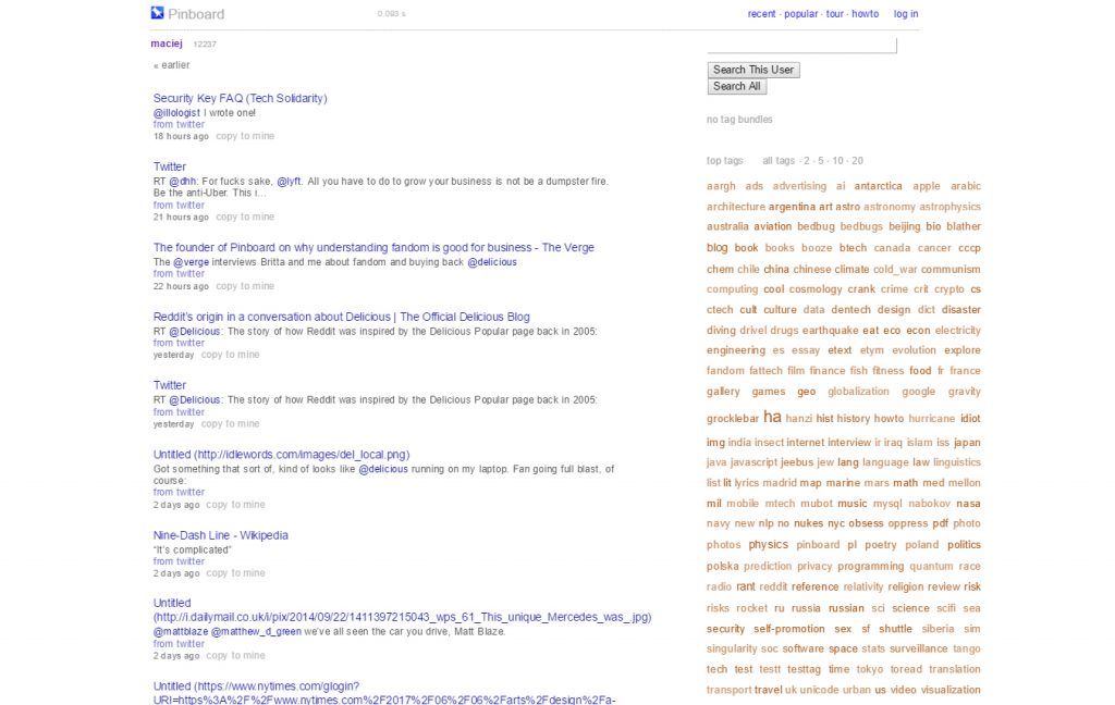
Pinboard’s primary bookmark UI (photo credit serafin.io)
Pinboard.in is probably the Brutalist interface that I have the most intimate relationship with. I’ve been happily using the bookmarking service since college and find it wonderfully smooth from a usability perspective, despite arguably having little superficial appeal. The author/maintainer of Pinboard, Maciej Ceglowski, has a lot of excellent writing on his personal blog, Idle Words.
Craigslist
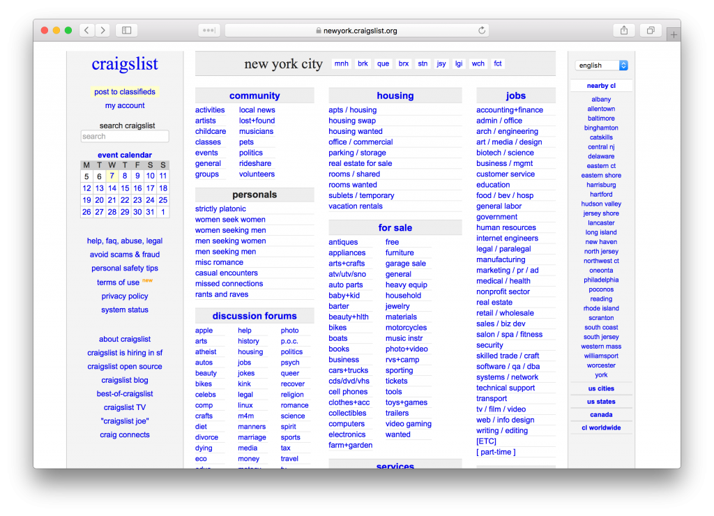
Craigslist has got to be one of the most canonical examples of Brutalist web design in mass use. Begun by Craig Newmark as an email list in 1995 and launched as a website in 1996, Craigslist has retained its stripped down, functional UI. Despite its design, Craigslist is one of the most popular websites in the entire world with an Alexa rank that always hovers around 100. This is because the design is in fact perfectly efficient for achieving its role of connecting local buyers, sellers, renters, job-seekers, romancers, etc.
NearlyFreeSpeech.net
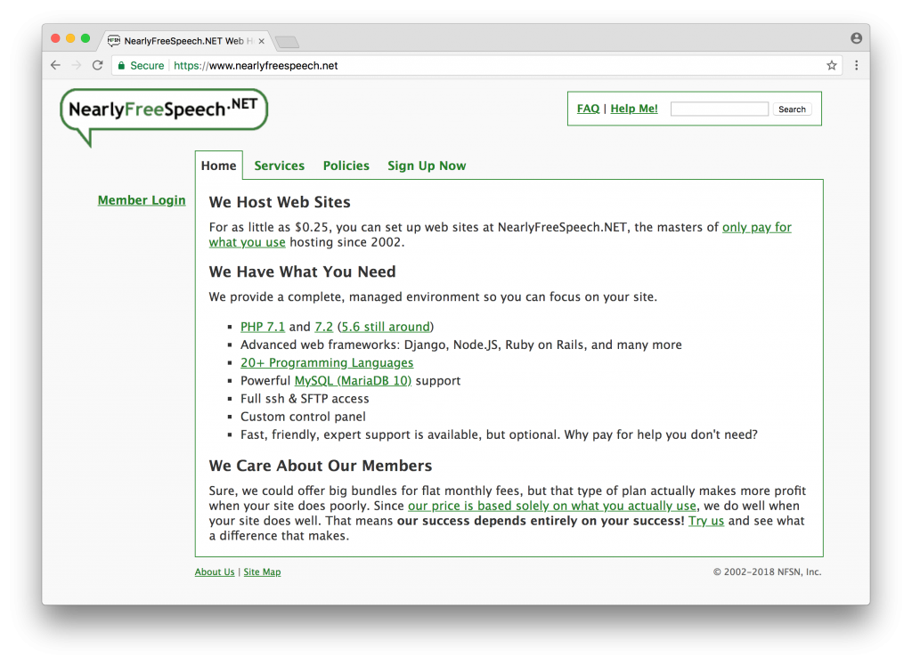
NearlyFreeSpeech.net is an old school shared host, and one of the best-regarded companies in this space. I still recommend NearlyFreeSpeech.net to friends with basic needs like WordPress hosting that might otherwise go with one of the EIG-owned megaliths like HostGator or BlueHost. For websites that have higher levels of traffic, it’s better to opt for a dedicated hosting plan.
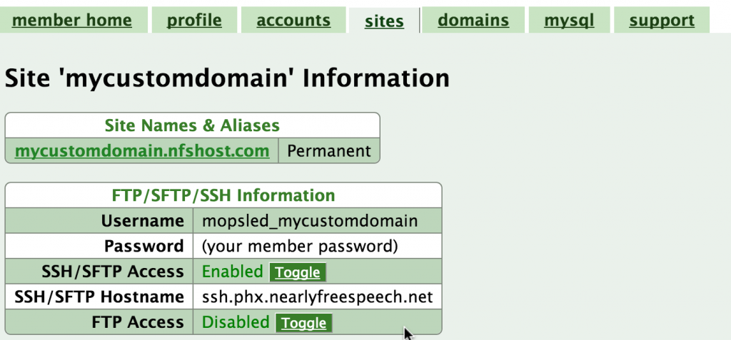
NearlyFreeSpeech.net site configuration UI (photo credit: mopsled.com)
The NearlyFreeSpeech.net admin interface is unapologetically functional and plain. In my opinion it is actually the perfect fit for the type of customer that they try to serve: people who have a reasonably grasp of the LAMP-type hosting stack and just want simple access to the resources at a good price.
Tarsnap
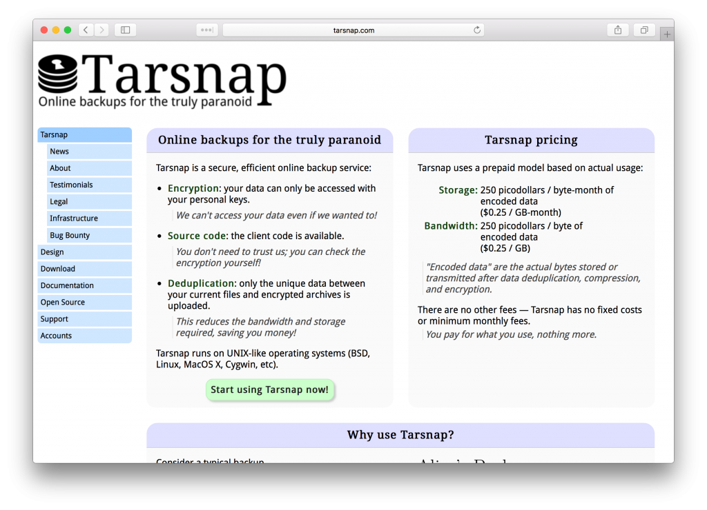
Tarsnap is a cloud backup utility that is popular among highly security-minded people who still require the convenience of backing up to the cloud. It launched on Hacker News and found its initial audience among the technical professionals of that community. The core backup functionality of the tool is accessed through command line and desktop applications, with the website providing account management, marketing pages and documentation. The Brutalist design seems to be perfectly effective at communicating the benefits of the service to its potential customers, and providing the administrative tools necessary for them to manage their accounts.
Linode
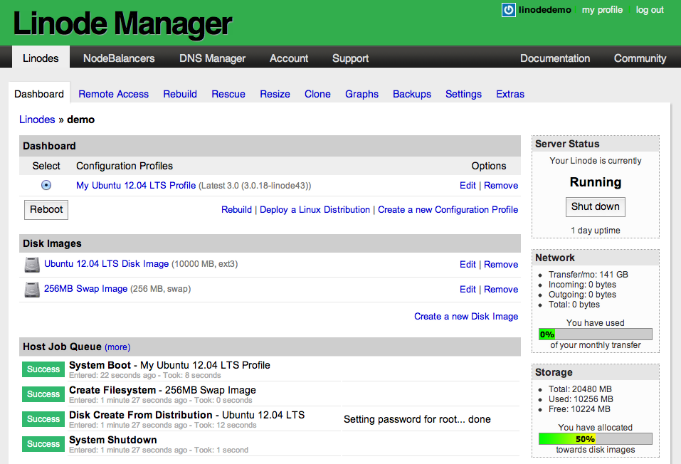
Linode Manager (source: Linode forums)
The trusty old Linode Manager, relatively unchanged for at least half a decade, is still the primary administrative interface for customers of the US-based VPS provider Linode. Some might say it’s a stretch to call this design Brutalist, and I somewhat agree, but with its user agent styled buttons, system typography and general lack of frivolous aesthetic adornments, it fits my own definition well-enough.
I happen to still love the Linode Manager interface. It is quick and functional, letting you perform all the actions that you need with your VPSes and related services. I find the presentation of critical stats reliably clear, and I actually even like the old school RRDtool based charting. I’m a little disappointed to learn it seems to be getting a rewrite.
Conclusion
There is a common thread among the sites that I’ve profiled here: the job that they do is so essential that a basic, functional interface is enough to keep users engaged and pleased. They are function first, aesthetic second. In a way I think this is a good reminder to all of us, even if we do highly value aesthetics.
The recent Reddit redesign is a good example of what happens when you neglect the primacy of function in pursuit of shallow aesthetic improvement: it is less functional and seemingly unanimously despised by users, despite having been “modernized” aesthetically (I am certainly filled with dread now every time I click through a link to Reddit from Google, anticipating the clumsy experience).
There are some people who feel that great aesthetic design is a base requirement for any product to succeed today. In some cases, I think this can be true – there are certainly domains where aesthetic is a competitive advantage. However, an emphasis on UI fidelity/polish can also be an endless time suck that sets you back months and keeps you from realizing what function is truly the core of your product’s value proposition, and achieving or maintaining a market fit.
Do you have any favorite examples of Brutalist or Minimalist web design that I’ve overlooked? Let me know in the comments section.


1 Comment
Hugo Delgadinho
about 5 years agoThank you for your perspective and I agree that this type of design is better for some type of websites, what makes totally sense because design isn't suppose to be an universal like the laws of gravity. For more I recommend this article https://www.imaginarycloud.com/blog/why-we-need-web-brutalism/ that explains this through the eyes of an UI designer.
Reply